Role
Product Designer (Designed and launched mini game, streak, and reward system. )
Timeline
August 2024- Dec. 2024
Contribution
Launched a new Game
Increase user retention rate
Increase user engagement time
Tool
Figma
ProtoPie
Adobe After Effects
Adobe Illustrator
Project Overview
The Shades News is a news & culture app for Gen-Z, allowing users to read quick summaries of multiple perspectives on current issues to get the full picture and engage with the content and other users with polls, takes, likes.
As a product designer, I worked on the app's puzzle games section, integrating it with news content to increase engagement and retention while encouraging more news reading. I designed engaging game mechanics and seamless transitions between sections, creating a smooth user experience that drives higher app usage.
DESIGN IMPACT
As a product designer, I focus on key customer app metrics like user retention and daily active users, ensuring design decisions drive measurable business impact.
▲ 2%
▲ 4.3%
▲ 10%
~11 k
28%
~ 3 mins


Daily Active Users
User Retention Rate
Pageviews & scroll depth
Problem to solve
Disconnected game and news sections confuse users and fragment the experience, reducing cross-section navigation and engagement.

BUSINESS MODEL
Generally, there are two primary models for news app: (1) subscription-based; (2) advertisement-based. For Shades, the CEO explained their decision to adopt the advertisement model to ensure the app’s content remains free and accessible to all users. This approach also aligns with their target audience, younger Gen Z, who may have limited financial resources.
bUSINESS METRICS
Adopting the advertisement-based business model means that attracting advertisers and securing funding depends on three key metrics: (1) the size of the user base, (2) user retention rate, and (3) the time users spend on the app. Currently, the team is exploring ways to enhance the in-app games to boost user retention rates.
Daily Active Users
User Retention Time
Pageviews & scroll depth
Primary research: User interview
To further understand the deeper reasons for the problem statement, we collaborated with the user researcher teams to conduct in-depth user interviews, and identified 3 key user pain points to offer actionable recommendations for bridging the games and news sections.
01
Users want content and gameplay to feel connected
“After playing, I couldn’t remember what I just read — felt like two separate apps.”
• 90% mentioned the need for content-game link
• 7/9 said game felt disconnected from the news
02
Games should be lightweight and not disrupt reading
“I skip the games if they interrupt the flow — I’d rather finish the news first.”
• 62% prefer light, simple games
• Users favor launching games themselves after reading
03
Prefer playful, visually rich interaction styles
“If the games looked more like Discord or TikTok, I’d open them more.”
• Many said current formats feel too basic
• Want more distinctive, fun design language
secondary research: Competitive analysis
To gain a comprehensive perspective on game design within news apps, I conducted a competitive analysis of NYTimes Games, Washington Post Games, and Fox News Games.

New York Times Games
Washington Post Games
Fox News Games
Game Type and Purpose
• Educational, mostly puzzle and word games.
• Educational, word-related puzzle games.
• Puzzle, quiz, and entertaining games tied to news and culture.
Engagement
• Fun and engaging; no rewards, but users can share results.
• No rewards.
• Fun interaction with general users’ quiz answers.
Monetization
• Subscription with tiers (Free, Limited Daily Play, Exclusive Access).
• Free with ads linking to other games.
• Free with general ads.
Social Integration
• None.
• “Play with friends” option.
• Shows user answers and percentages for quizzes.
Game uniqueness
• Inventive games like Wordle and Spelling Bee, often collaborations.
• “On the Record,” a quiz based on news stories.
• Includes interactive features like multiplayer experiences .
Design principles
Based on the users needs and product goals, we identified and defined 4 key design principles we all agree to follow during the design process:

Don’t Disrupt News Reading
Games should extend the reading experience, not interrupt it. Let users focus on the news first, then engage interactively.
Lightweight & Easy to Pick Up
Young users prefer intuitive, low-barrier gameplay. We prioritize simple mechanics that are easy to understand and quick to start.
Content Relevance
Games should relate to the news content, enhancing comprehension and engagement.

Playful Interaction, Rich Visuals
Interactions should be fun and visually appealing. A distinct, expressive style helps make the app feel like it belongs to this generation.
... integrate the game and news sections through engaging, relevant, and lightweight experiences to promote the new game feature, in turn drive deeper news exploration, and stronger user retention.
Design exploration
We began by exploring common industry approaches to integrating games with news. One direction involved immersive, narrative-driven simulation games where users take on roles within the news itself. While this offers deep integration, we found it challenging to apply consistently due to the lack of complete and structured news stories suitable for this level of integration.
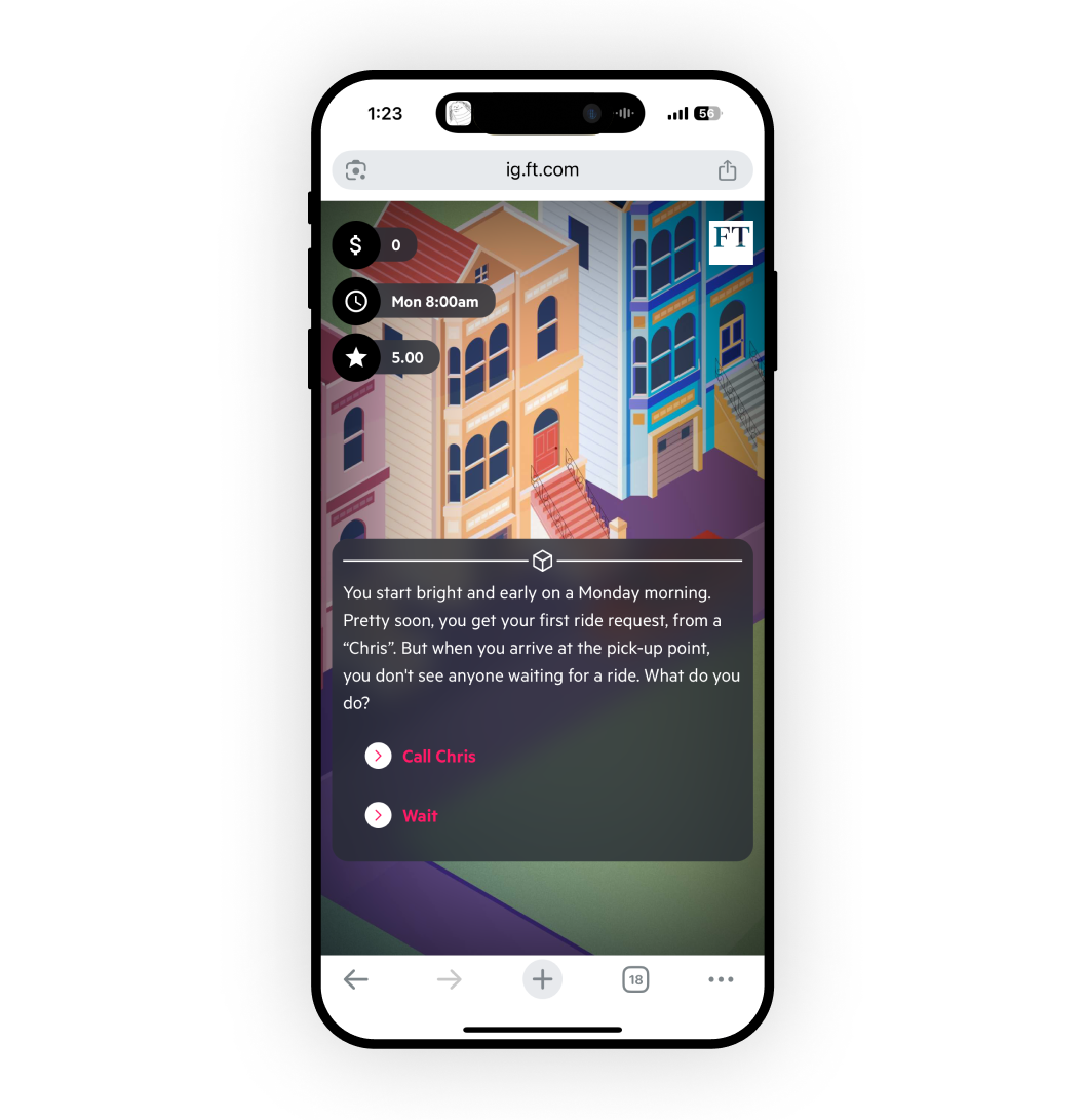

Role-Based Immersive and Interactive News Simulation Game
While it enhances immersion, the high development cost makes frequent daily production difficult.
So we opted for a more traditional and widely used format: daily quizzes based on the news users read. While this approach can risk feeling repetitive, it’s sustainable for daily production and familiar to users, making it easier to adopt and scale.
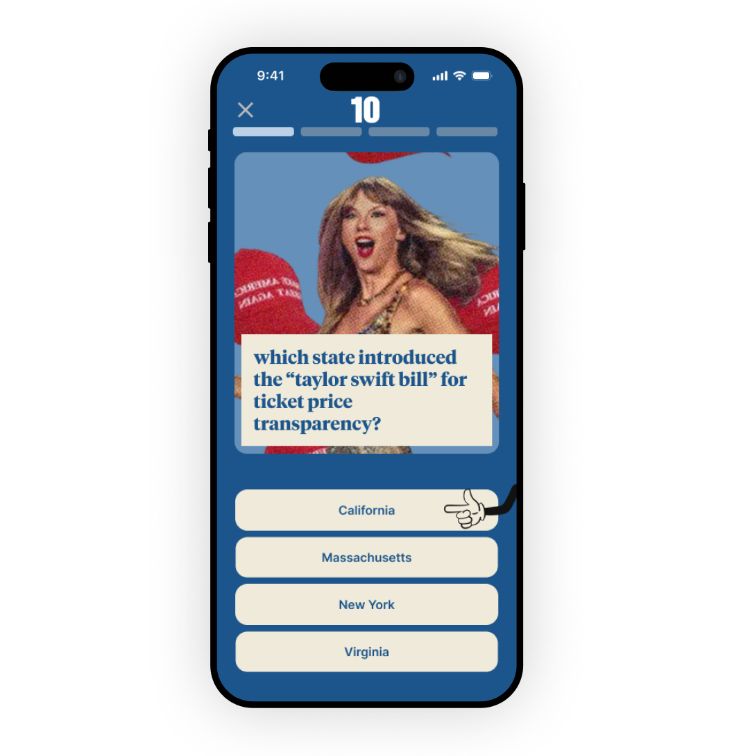

Daily Quiz Format
Easily produced at high frequency and familiar to users, but often feels generic and lacks engagement.
Design PROCESS
Design Decision 01
Innovating game Interaction format
We recognized that the traditional Q&A format could feel dull, and users expressed a clear desire for more engaging interactions and richer visuals. This led us to rethink the daily quiz experience by breaking down news content into core elements—images, keywords, and numerical data—and designing new interaction patterns around them. For example, users can guess the blurred cover image, fill in missing words from headlines, or judge whether a number is higher or lower, making the experience more playful and dynamic.
Design Decision 02
How to Discover Games While Reading News Naturally
The second key design decision focused on how users would naturally discover the game section within the news experience. We wanted to ensure sufficient visibility without being invasive, aligning with our design principle of preserving uninterrupted news reading. To explore this balance, we brainstormed 15 solutions—ranging from highly intrusive alerts that pause reading to subtle red badges.
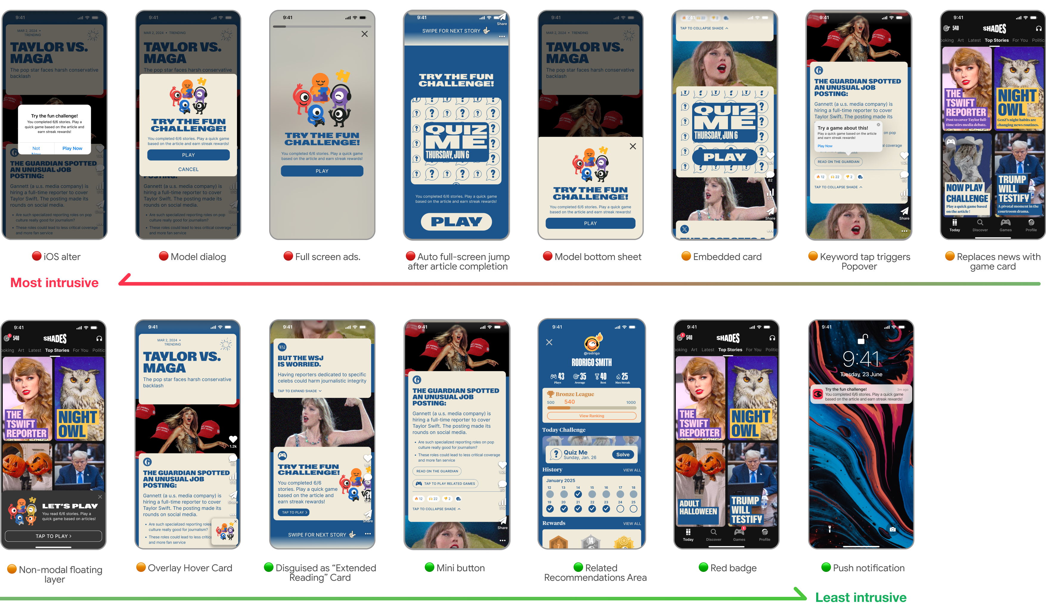
15 designs for introducing games in news sections — ranked from most to least intrusive 👾📰
Discover Games While Reading News Naturally - On Newsstand Page
On the newsstand page, while users are reading a story, we selected four mid- to low-intrusion options for integrating the game entry point. We ultimately chose to disguise the game as an “extended reading” card, as it seamlessly aligns with natural reading behavior and feels like a logical continuation of the content.

Option 1
Option 2
Option 3
Option 4
🟢 Pros
- Highly contextual and semantically linked to content- Encourages discovery via curiosity
- Very visible due to floating position- Maintains visual presence throughout reading
- Lightweight UI- Blends well with article layout- Doesn’t interrupt user flow
- Seamlessly follows natural reading behavior- Feels like a logical continuation of content
🔴 Cons
- Requires user to tap a keyword to trigger- Interaction pattern may be unfamiliar or overlooked
- May slightly distract users during reading- Can feel intrusive if not well balanced
- Low visibility if not styled prominently- May be overlooked in dense articles
- Only appears at the end of article- May be missed by users who don’t finish reading
Discover Games While Reading News Naturally - On Homepage
After selecting the game card at the end of the story as our primary entry point, we realized some users might not scroll down far enough to see it, leading to low visibility. To address this, we designed three complementary entry points on the homepage: a non-modal sheet, a game card in the same visual style, and subtle red badges to remind users and drive discovery.

Design Decision 03
How to create a natural flow back to news content from game section
The third key design decision point is in the games section how can we create a natrual flow back for users to back to reading more news? we also explore the following options

Option 1
Option 2
Option 3
Option 4
🟢 Pros
-Users can immediately learn more when unsure about a question.- Direct connection between game content and news.
- Natural placement at the end of gameplay. - Encourages follow-up reading
- Encourages users to read more before accessing the game.- Promotes daily news engagement.
- Feels integrated with progress tracking. - Naturally tied to user achievements.
🔴 Cons
- Interrupts game flow.- Hard for users to return to the game after leaving to read.
- Users may ignore the links or forget game context.
- May feel like a barrier or chore.- Risk of drop-off due to complexity.
- Could be too hidden or overlooked by users.
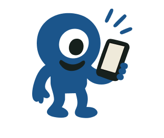
branding graphic Exploration
As a side project, we explored three mascot and avatar designs for the app: 1. Inspired by the app’s focus on diverse perspectives and the octopus’s ability to change colors. 2. Based on the Shades logo, symbolizing viewing world events and perspectives. 3. Directly integrates the “shade” element from the Shades logo.

These illustrations are my original designs, created using Adobe Illustrator and Figma.
Style
Relevance
Memorability
Engagement
Option 1(Animal, Octopus)
🟢 Real-life animal
🟡 Loosely fits the idea of perspectives
🔴 Feels generic, not distinctive
🟢 Personal, Gen Z-friendly
Option 2(Abstract, Circular Eye
🟢 Fictional item
🟡 Inspired by app logo (eye)
🟡 Unique monster-like design
🟡 Playful with a cute/quirky balance
Option 3(Abstract, Almond Eye)
🟢 Fictional item
🟢 Directly reflects brand identity
🟢 Logo-based + recognizable
🟡 Same playful-monster tone as Option 2
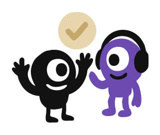
We integrated the streak system with dynamic mascot widgets for the phone screen. The mascot’s expressions reflect streak progress—cheerful for maintained streaks and disappointed for broken ones—creating a playful feature that motivates users to stay engaged and return regularly.

Widgets with Streaks on Homescreen
Tracking design impact
▲ 2%
▲ 4.3%
▲ 10%
~11 k
28%
~ 3 mins
Daily Active Users
User Retention Rate
Pageviews & scroll depth
Reflection
1. Proactive Communication and Initiative: At the beginning, I noticed a lack of accessible user research insights, even though the company had a dedicated user experience research team. Collaboration between teams was minimal. I took the initiative to address this gap by reaching out to the CEO and the different teams to advocate for access to research data. Through this, I obtained user research documents, enabling us to design solutions that were better aligned with user needs.
2. Reflections on User Testing: Looking back, I recognize the importance of conducting more user testing, especially since this is a consumer-facing (to-C) product. Increased testing would have provided valuable insights into user behavior, helping us refine the design further to enhance engagement and usability.
3. Success Metrics and Business Model: During the internship, I recognized the importance of defining clear success metrics to measure the impact of our designs. While working on the streak system and game interactions, I ensured we tied our designs to measurable goals, such as user retention rates, time spent in the app, and the frequency of streak completions.


