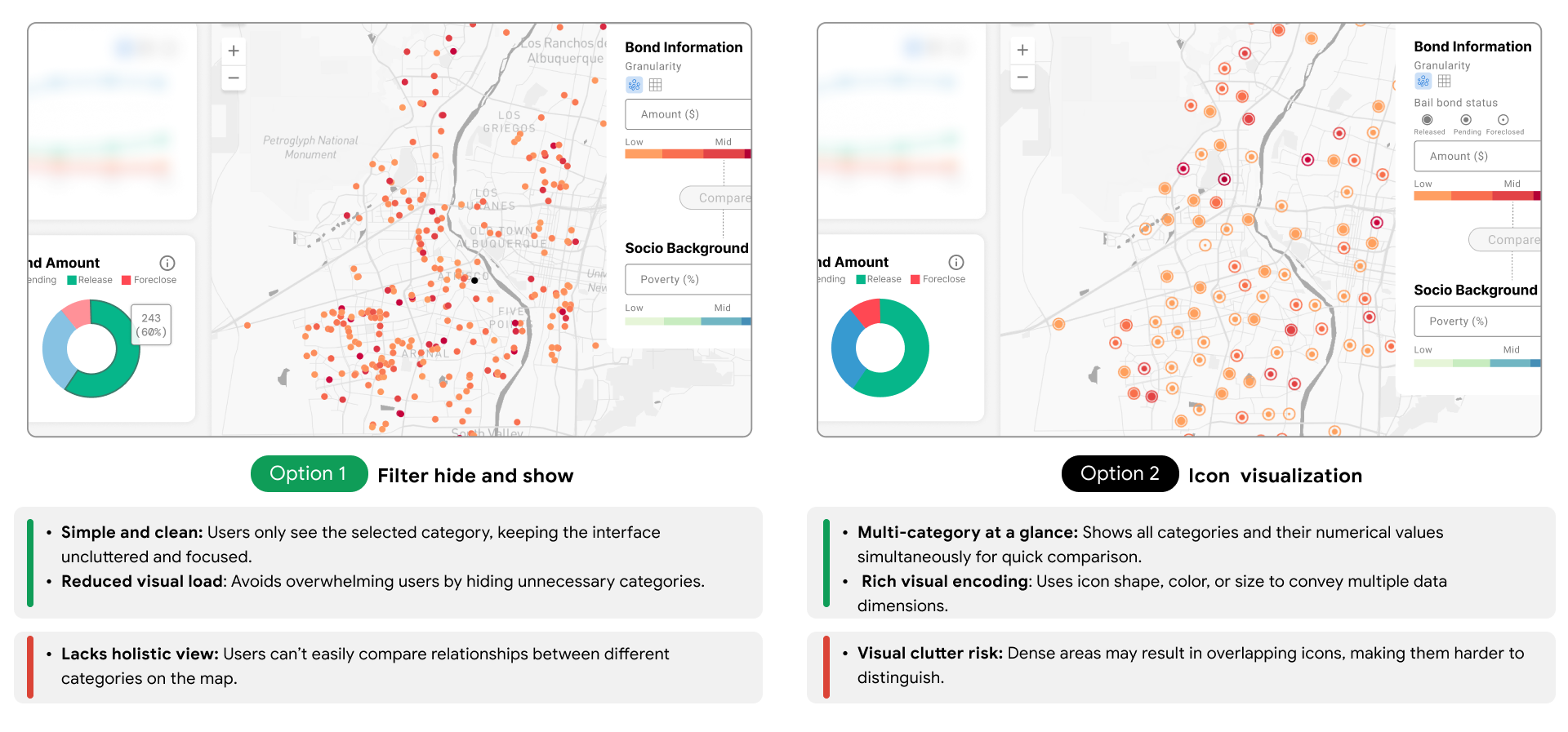
Compare in maps
I explored different ways to compare the two datasets to help users identify areas with severe financial burden and bail bond issues—such as overlaying visualizations, placing two maps side by side, or integrating them into a bivariate map for clearer insights.
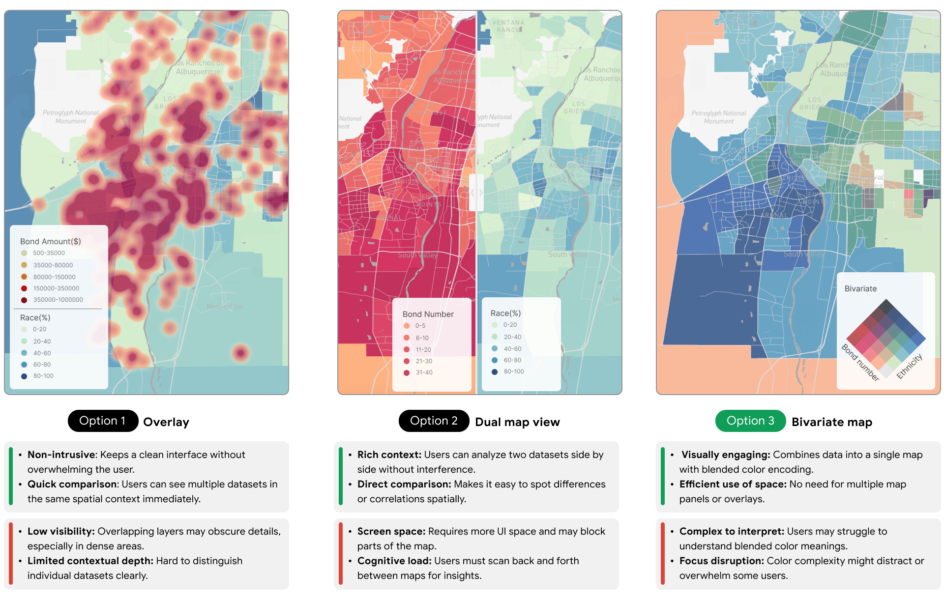
I used Mapbox Studio to test colors, text contrast, and transparency, ensuring clear layouts and accessible visualizations.
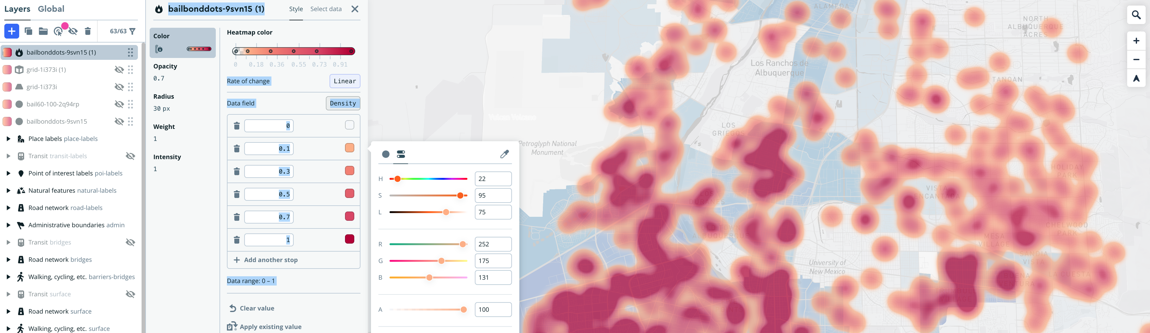
To improve accessibility, I optimized map colors for contrast and tested them against four types of color blindness: Protanopia, Deuteranopia, Tritanopia, and Achromatopsia, ensuring critical elements stayed readable.

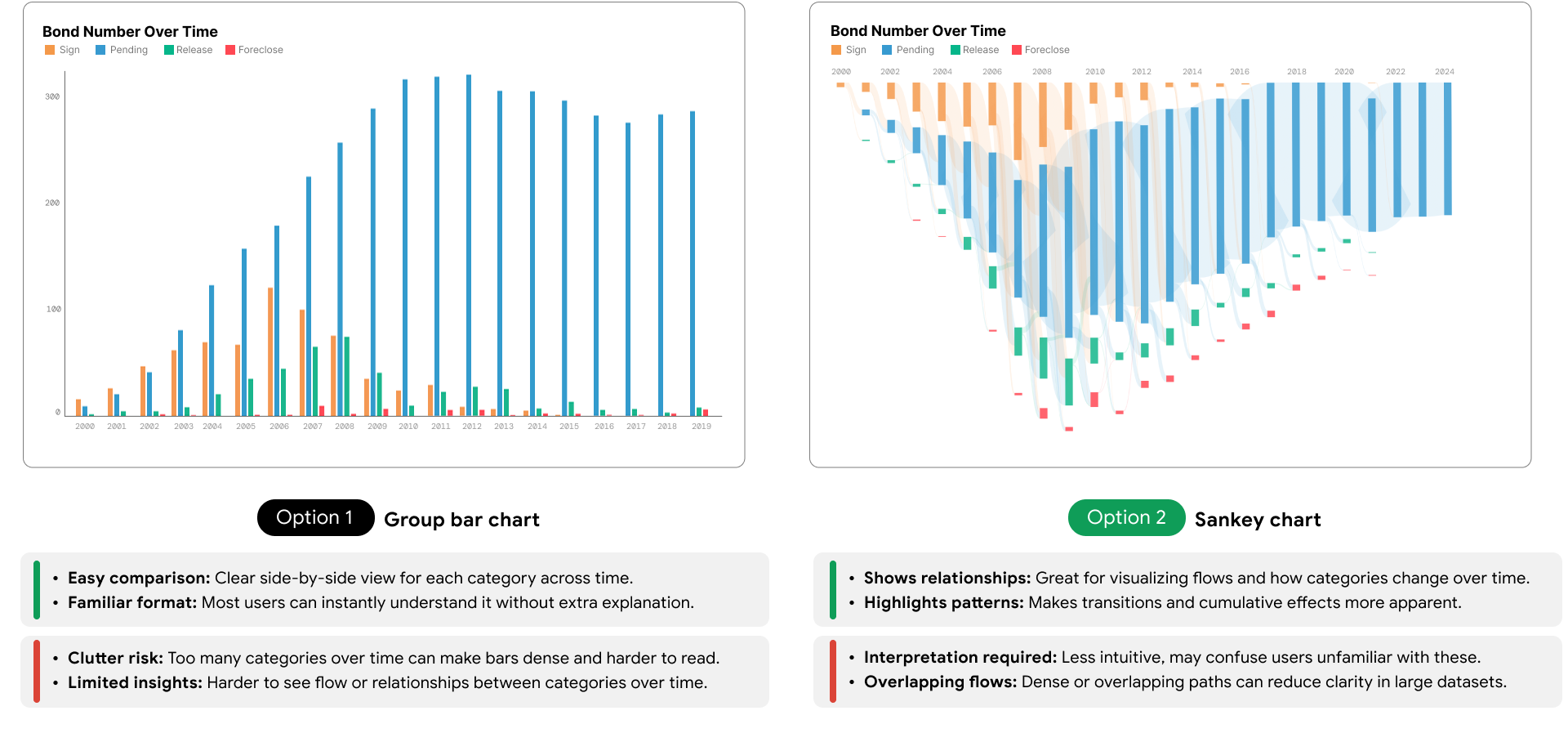
Compare in charts
Beyond mapping the datasets at the geolocation level, I designed and tested chart-based visualizations—using common comparison practices like grouped bar charts and scatter plots.

To address overplotting with 406 data points and labels, I tested reducing label size, highlighting key labels, and hiding all labels to show on hover.