Overview
I worked across the product and business communication teams at
WindBorne Systems ↗, a climate AI company based in the San Francisco Bay Area. WindBorne is building a next-generation weather intelligence system by launching a plantary balloon network to fill in gaps left by traditional satellites, enabling more precise forecasting through AI models.
In my role as a Creative Designer, I contributed at both product and storytelling levels. I created public-facing data visualizations for social media graphics, client pitch decks, and product launch materials—translating complex data and AI systems into clear, engaging narratives for non-technical audiences, such as how the weather machine learning models work, how the balloons operate, and interesting weather events.
sf climate week data viz animation
Created for San Francisco Climate Week, this visualization reveals how WindBorne's weather prediction system works: data collected from weather balloons across multiple channels feeds into a neural network with cross-attention mechanisms, creating a latent space represented on a HEALPix grid. The model then generates high-resolution global weather predictions, transforming sparse balloon observations into comprehensive atmospheric forecasts.
Balloon data transformed into global weather forecasts through neural networks.
An alternate version of the balloon flight visualization. This animation flows continuously: all flight paths start plotted on a world map, morph into a grid layout showing quantity in a more direct way, then transition into a scatter plot revealing relationships between altitude, speed, duration, and vertical distance.
Balloon flights transformed: geographic trajectories → gridded layout → altitude and performance analysis.
Another exploration: transition from a Mercator map to globe, turning flight paths into dots—each representing individual data points collected by the balloons.
Mercator to globe transition, decomposing flight paths into individual data points.
Interesting Weather event visuals
Created to showcase WindBorne's forecasting capabilities during an early spring heat wave, this visualization compares two perspectives on extreme heat: where March temperatures could exceed all historical records (1950–2024), and how many days within the next 15 days could break March heat records at each location. The side-by-side maps reveal both the geographic extent and temporal intensity of the anomaly, turning a 15-day forecast into a clear story about unprecedented heat.
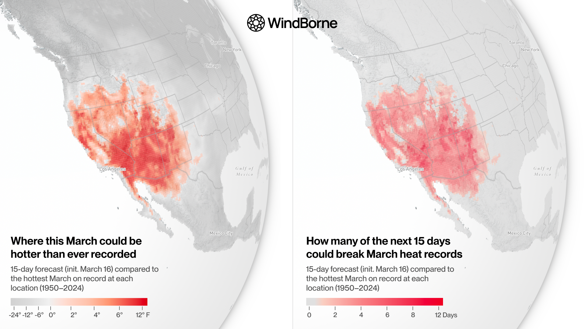
March heat wave: forecast vs. historical records (1950–2024)
Built for the AR Reconnaissance blog post, this visualization shows an atmospheric river event over the North Pacific in real time. The 500-hPa relative vorticity field appears as a textured layer on the globe, revealing the upper-atmospheric dynamics driving the storm, while WindBorne balloons collect data along the moisture plume—each balloon labeled with its ID and current altitude. The piece connects large-scale atmospheric patterns with in-situ observations happening at that exact moment.
Atmospheric river with real-time balloon observations and 500-hPa vorticity
A snapshot of WindBorne balloons collecting data in real time, set against 500-hPa height contours showing a blocking high over the West Coast and a downstream low over the Atlantic. The visualization connects large-scale pressure patterns with ground-truth balloon observations threading between the ridge and trough. Each balloon displays its ID, altitude, and recent trajectory.
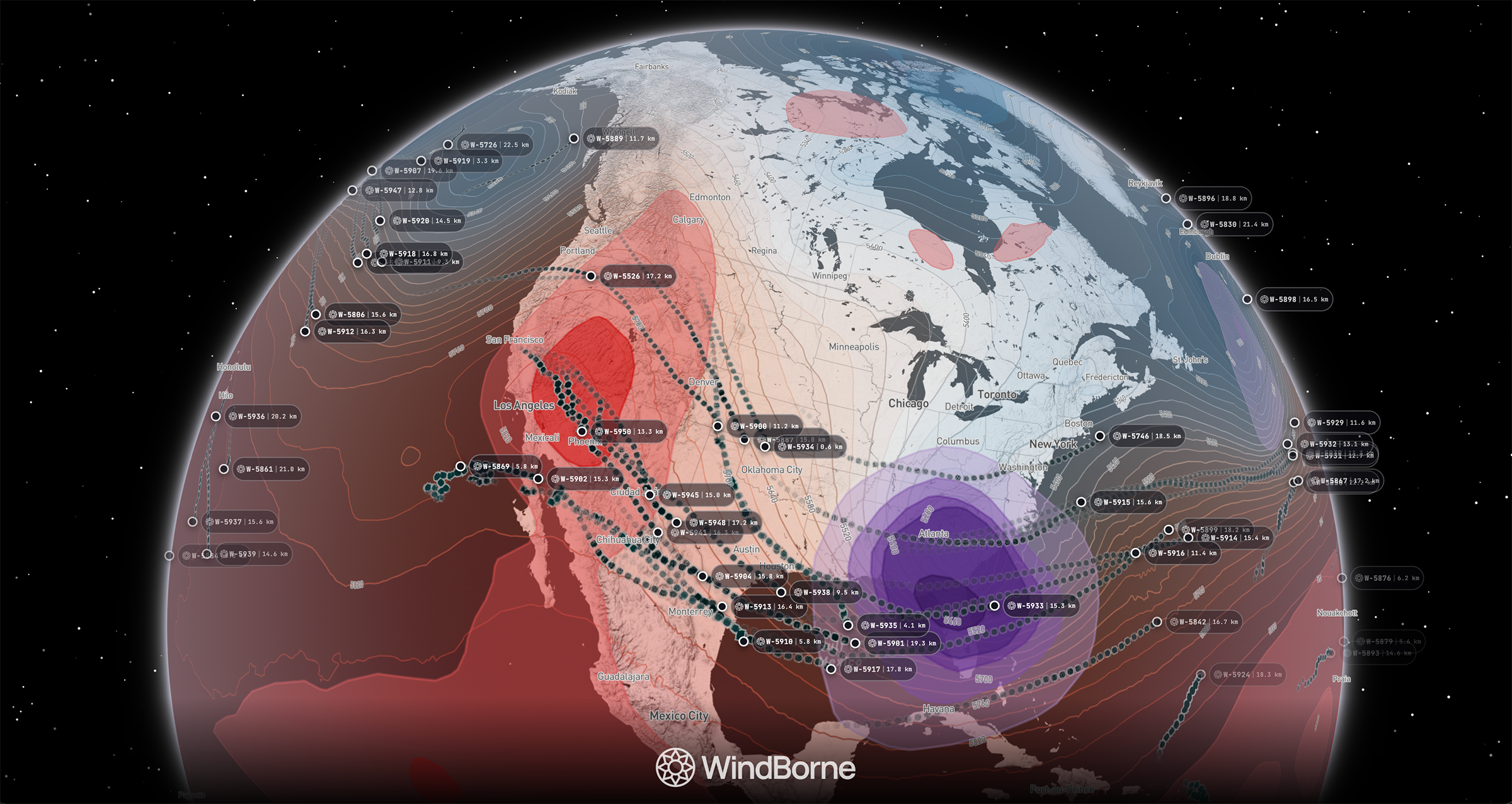
Blocking pattern: balloons traversing high and low pressure systems
vISUALS FOR THE outage prediction PRODUCT
Visual design for WindBorne's utilities outage prediction product, showing multi-resolution forecasting capabilities. The interface presents predicted customer impacts at three geographic scales—county, city, and neighborhood—using H3 hexagonal grid cells. Each resolution level reveals different operational insights: county-level for regional planning, city-level for resource allocation, and neighborhood-level for precise crew dispatch. The visualization translates weather-driven outage predictions into actionable spatial intelligence for utility operators.
Customer impact forecasts across three geographic resolutions
Architecture diagram of the outage prediction system: weather data, utility assets, and land features feed into hybrid AI-physics models, generating spatially-resolved predictions for operational hazards, crew deployment, infrastructure risk, and customer impacts. Input layers to actionable outputs.
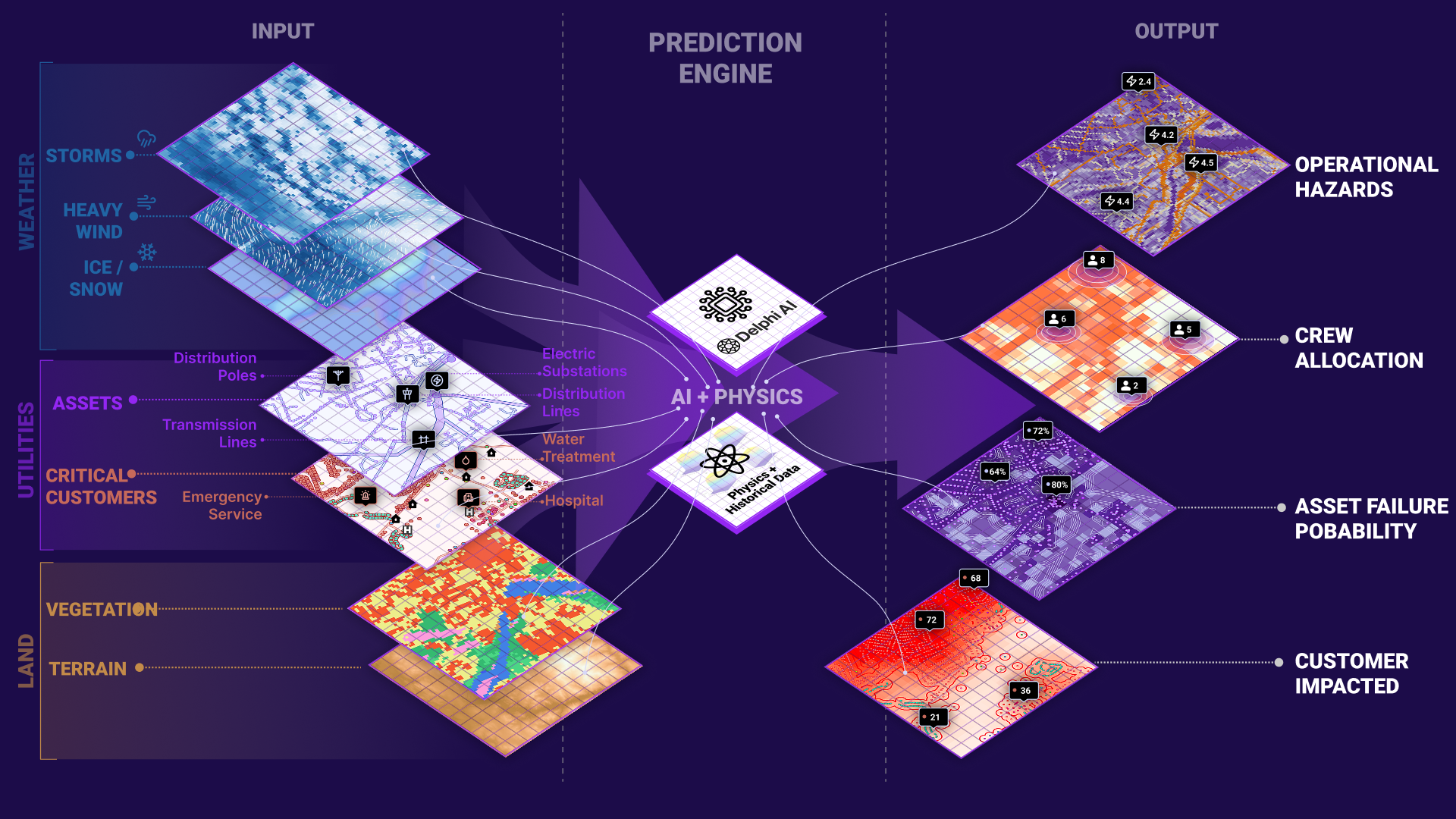
System diagram: inputs, models, and multi-resolution outputs