USER are facing these challenges
We conducted user survey and in-depth interviews with people also from a various demographic groups, including visitors, transplants, and locals. These are the highlights of research:
01 Limited Landmark Visibility
Users don’t often see enough recommendations for interesting or relevant landmarks when using the map especially less-known hidden gems.
02 Unclear Value Perception
Users are unsure whether a place is worth visiting and want a clearer sense of what to expect before committing their time.
03 Fragmented Experience
Users struggle to connect the dots between scattered landmarks, they want to make the most of their time, but existing guides feel fragmented.
SO users try to... creatively outside the app
We observed an interesting user behavior: when people want to explore new places, they find that Google Maps lacks recommendations and no planning features. They also don’t fully trust the limited visuals. As a result, many turn to RedNote, where they can search for destinations, learn more about them, and plan mini trips by browsing user-shared blogs that include very creative annotated maps.
Design Principles
We discussed and set these four key design principles that we felt very important to making sure our designs align with the the whole all product goals and improve user experience.

Visual Appealing
Visual-focus content to attract users and give them authentic preview.

Customizable
Allow users edit and personalize their cultural walk experiences.

No Interruption
Seamlessly integrate into the existing navigation experience without disrupting the user’s natural flow.

Easy to Go
Reduce the troubles users foresee before they take on the visit.
Success metrics
We also defined three key success metrics aligned with both business objectives, product goals, and user goals to evaluate the impact of our solution.


Click-through rate on cultural place recommendations
Visit to cultural places
Time spent viewing cultural place details
SOlution Exploration
We explored a range of potential design solutions and ultimately narrowed down to three core concepts: Search Recommendation – Surface landmark suggestions during map search based on location or history. Thematic Guide – Curate cultural places around specific tags or themes for quick browsing. Proximity-Based Walking Tour – Recommend nearby landmarks in a planned route format.


Design refinement
Design process 01
Recommend Walking tour list
We identified four key design factors to curate an engaging and balanced walking tour experience. For each, we evaluated trade-offs to guide decision-making: Entry Location – Where the tour begins and how accessible it is to users. Tour Length – The number of stops and walking time based on user tolerance. What to Recommend – Selection of landmarks based on cultural value, local relevance, and uniqueness. What Information to Show – The type and depth of content surfaced for each stop (e.g. visuals, user reviews).


Design process 02
Recommendation During the Walk
During users walking, how can we recommend places for them to add stops.
Design process 03
AI-Generated Detour rather than fastest path
To support our design goal of helping more people discover, learn about, and visit cultural landmarks—including local residents who typically navigate directly to known destinations—we introduce a lightweight intervention at a key decision point. Just as the user hits the “Start” button for directions, we surface an optional Culture Walk button. This generates a slightly longer route that includes 1–2 nearby landmarks, offering a culturally enriched detour without disrupting their original destination or intent.


Final Prototype Showcase
Final Design 01
Recommend Walking tour list
Users can access the Walking Tour Guide from the Explore tab at the bottom. The list includes several landmarks with key information, and users can tap to learn more, as well as edit or remove stops as they plan their route.
Final Design 02
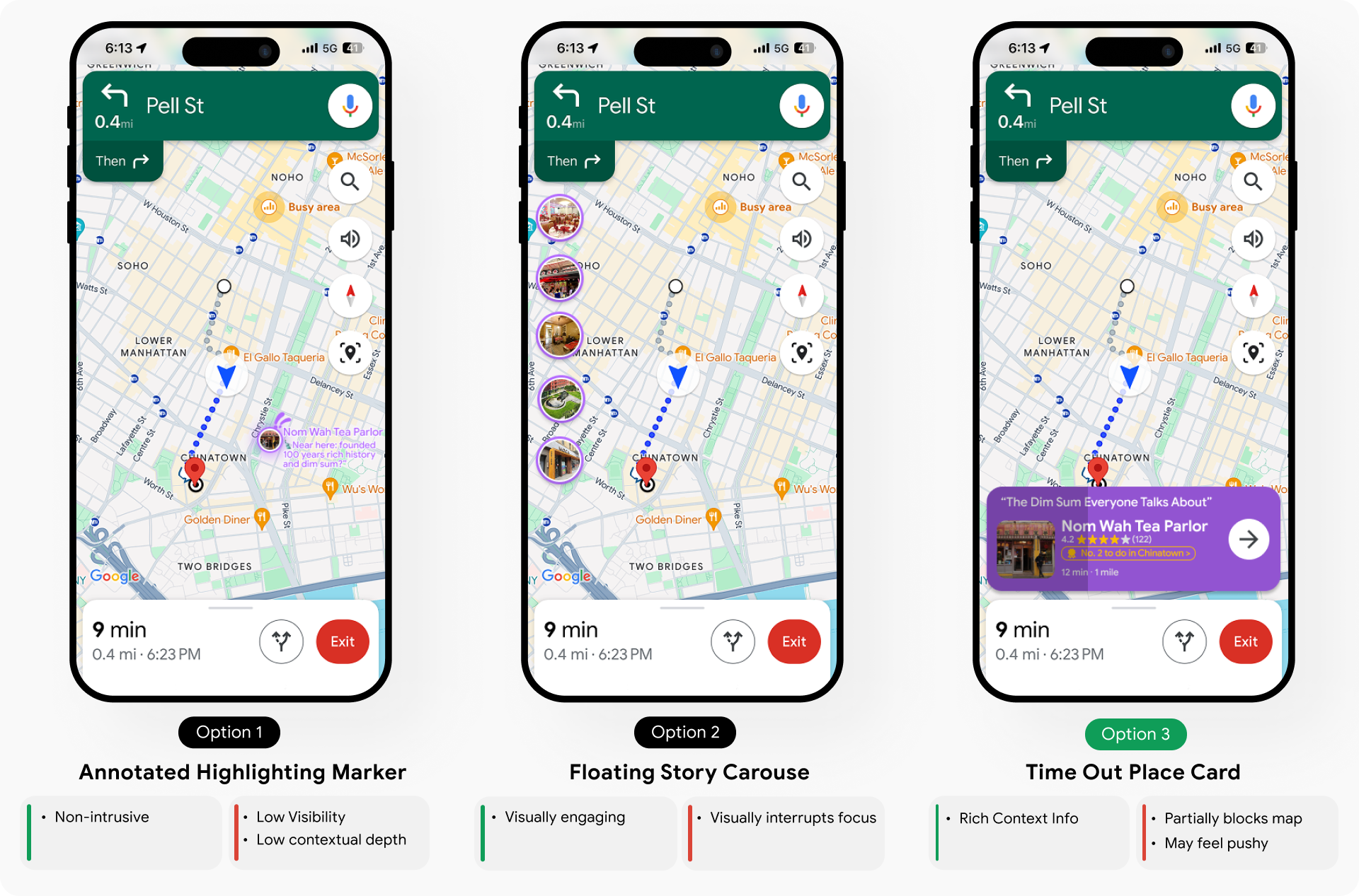
Recommendation During the Walk
When users pass by landmarks, a time-out card slide in providing an overview image of a nearby landmark. If Interested, users can click to learn more and maybe add stops to the current route.
Final Design 03
AI-Generated Detour
For users with fixed destinations, we introduce a gentle nudge right before they tap “Start.” An optional mode tab offers an AI-generated detour with 1–2 nearby cultural landmarks—enhancing the journey without disrupting their original route.
Final Design 04
Immersive learning in Live view mode
In Live View mode, users can tap on landmark icons to reveal anchored bubbles highlighting architectural details. Tapping a bubble opens a fact card with more in-depth information about the cultural or historical significance of the site.
Reflection & future development
1. User Research Insight: When conducting user research, I put myself in the users’ shoes to understand how they might interact with this feature. For instance, users might be on the move, possibly outdoors, so it’s essential to prioritize audio functionality and ensure text is large and easily readable.
2. Prioritizing Features with Time Constraints: With only two months to complete the project, we had to be strategic about which features to implement. Instead of trying to build everything, we should focus on selecting one or two core features and developing them thoroughly. It was more valuable to dive deeper into a specific user group’s needs and continuously iterate toward perfection than to add more features.
3. Working with Limited Resources: We had limited opportunities to check in with our Google mentors, so I had to maximize each interaction. I relied heavily on strong documentation to clearly present my progress during reviews, ensuring I received the feedback needed to drive the project forward.


